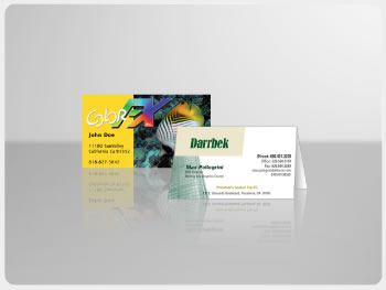
If you’re an entrepreneur or you do a lot of business networking than you understands the importance of having a business card. In fact, the business card is one of the most fundamental requirements for the average business man. Unfortunately, it’s such a common scenario for someone to easily forget about you especially when people often create “forgettable” business cards. The common business card usually consists of a plain white card with the name of the person or company and basic contact information. With everyone using such a similar format it is no wonder why most boring business cards find their way into the trash can. This is why it is so important to make your card stand out from the sea of mundane business cards.
With that said, the challenge really is creating a business card that stands out but still maintains a professional demeanor. Depending on how flexible you are in how you want to “portray” your image in your business card this will determine the design choices you have at your disposal.
We will be examining the following elements more closely:
- Color Choices
- Layout
- Logo and Pictures
- Typography and Font
Let’s dive into this concept some more and figure out how we can break down the business card design process from various prospective.
The Flexible Professional
If you are a design company or freelance artist than chances are you can and should be fairly bold in your business card design. These types of professions encourage creative and innovative designs that are outside the standard professional business card design. Instead of using a white color as your base you can get away with using something eye catching like red or blue. This will instantly make your business card stand out from everyone. You can also play with the layout and go with a vertical layout instead of a standard horizontal layout. With such unique features in your card you better have a unique logo on the card as well. This is purely a design choice and everyone must use their own artistic judgment to create a nice logo. Finally, you can use non-traditional typography or fonts on your business card to really put the icing on the cake. You can always play with different font colors because you are no longer restricted to the normal black and white color combination. You can also experiment with double sided business card printing and have something printed on both side of the card. If you fall into the flexible professional category than you have no excuse not to have an amazing business card that stands out from the rest.
Middle of the Road Professional
As a middle of the road professional you still have plenty of room for flexibility but you probably wouldn’t want to stretch those limits too far. Using the same criteria as above let’s review what you can do to your card if you fall into this category. First off, you probably shouldn’t commit to an eye blinding color such as red for your business card but you also don’t have to go with a traditional white color. Try exploring different colors that are not too flamboyant but will still make your card stand out. Certain earth tone shades and gray may be the perfect color to provide that subtle hint of awareness without overdoing it. The traditional layout is fine if you decided to go that route but make sure you maintain a focal point to help catch more attention. Your logo or a picture can easily provide a focal point for someone who is looking at your business card. Make sure you put an emphasis on this element. Finally, when choosing your font or font colors the same rule applies as choosing your main color. You can experiment with different colors that are not black but make sure your card is still legible.
The Super Professional
Well there’s good news and bad news for your Mr. or Mrs. Super Professional. The bad news is that it is more difficult for you to create an eye candy business card without breaking tradition. The good news, you can still apply certain elements to make your business card stand out. First, if you don’t want to move away from the white business card background you can apply a gloss finish that will help make your card shine. Sometimes a gloss finish is only needed on the front side of the card, especially if you use these cards for trade shows. The reason for this is because sometimes it is more convenient for the business card recipient to use the unfinished backside of the card to write more information about you or your company. You can play with the layout of your card and move certain elements, like the contact information, in different areas that are not commonly used. For example, you can use the top left area instead of the common bottom right area for your contact information. The most important element for the super professional is to put a picture or logo of their company onto the business cards. Most business cards don’t put a picture so this is really your time to shine.
These are some of the elements and design choices that will go into designing a business card. Regardless of what type of professional you are, nobody can dispute the fact that it is important to have a nice business card that stands out. Your card temporary becomes a representation of who you are so it’s important to have a nice card. Take a little more time to put some efforts in your card designs and it will pay off in the long run.